When teams build a B2B company deck in Figma, the cover and opening page often receive the most attention. They adjust the logo, refine the headline, and arrange the company history, product description, features, and examples in sequence.
Customers do not necessarily read in that sequence. A marketer may look for use cases first, while an operator wants to see how the product works. A decision-maker may jump to scope and cost, and a security reviewer may search for technical conditions. Everyone opens the same deck with a different first question.
That is why the first CTA in a company deck is not the “Contact us” button on the final page. It is the table of contents and information structure that help each reader find the right material.
What do customers look for first?
Many company decks move from vision to founding story, history, organization, product, features, customers, and contact details. This sequence makes sense to the company telling its story, but a new reader may begin elsewhere.
- Is this service relevant to our situation?
- What would change in the way we work today?
- How would we actually use it?
- How have similar teams applied it?
- What should we check if we want to learn more?
When the information follows these questions, a customer can find what matters without reading the entire company history. Before choosing colors and components in a Figma template, define who will open the deck and which question each person brings.
Turn the table of contents into a map of questions
A table of contents labeled “Company, Service, Features, Customers, Contact” shows what the deck contains. It does not tell a reader which section is meant for them.
The same material becomes easier to navigate when the labels reflect the reader’s questions.
- Replace
CompanywithWho is this service for? - Replace
ServicewithWhat changes in the current workflow? - Replace
FeatureswithHow does it work in practice? - Replace
CustomerswithHow do similar teams use it? - Replace
ImplementationwithWhat should our organization check first? - Replace
ContactwithHow can we take the next step?
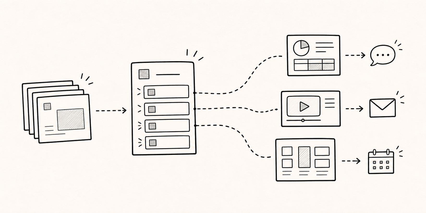
This version does more than list pages. It lets the reader choose a route. Keep the primary choices scannable in one view, and make each item answer one distinct question.
Use the customer’s working language rather than internal team labels. “How multiple teams use the same current material” is more concrete than “Integrated management,” and “See which content was revisited” sets clearer expectations than “Analytics.”
Leave one decision on each page
A minimal company deck is not a deck with very little content. It is a deck that asks the reader to make one decision at a time.
When features, use cases, outcomes, customer logos, and a contact button all appear on one page, the amount of information rises while the main point becomes harder to remember. When each page answers one question, readers can skip to the sections they need without losing the thread.
One possible flow looks like this:
- Cover: State in one sentence who the deck is for and what change it proposes.
- Table of contents: Let readers choose the route closest to their question.
- Current situation: Describe the friction they already recognize in their work.
- Solution flow: Show how the work changes rather than listing features.
- Use context: Explain where the approach fits by role or situation.
- Evidence to check: Connect the claim to a real screen, public example, or verifiable source.
- Next action: Offer a question, demo, conversation, or request for more material.
Not every deck needs to follow this sequence. The principle is to put the customer’s next decision ahead of the company’s preferred talking order.
Place CTAs where the question becomes specific
If “Contact us” appears only on the final page, a reader who opens only the relevant section may never encounter it. Repeating the same meeting button on every page creates the opposite problem: it keeps asking for a decision before the reader has enough context.
The useful part of a CTA is not its size but the action that makes sense at that point.
- After the table of contents or a one-page summary, offer
See examples for my industryorSee how the workflow works. - After a feature or workflow explanation, offer
Ask what to check in our environmentorWatch a short demo. - After scope and operating conditions, offer
Request an internal review packorSee available meeting times.
Instead of repeating “Contact us,” change the wording and destination according to what the reader may need next. A CTA is the next action someone can realistically choose at that moment.
Build the structure in Figma and connect actions in the distributed document
Figma is where teams manage the visual hierarchy and the editable source. The document sent to customers serves a different purpose. Editors need layers and reusable components; readers need navigation and a clear way to ask a question.
FeatPaper’s official Figma plugin guide describes selecting frames, converting them into a FeatPaper document, reviewing viewer and lead-form settings, and sharing the result as a link. It also describes connecting tools such as Calendly, spreadsheets, and video to the document experience.
Finishing the pages in Figma is therefore not the end of distribution design. After moving the material, review these questions:
- Can a reader find the relevant section from the table of contents?
- Are videos and supporting material placed where explanation is needed?
- Is there a clear reason to turn on the lead form?
- Can the reader choose an appropriate contact route where a question may arise?
- How will the distributed version be updated after the source changes?
This is not about replacing Figma. It is about keeping the familiar creation workflow while adding the choices required in the version customers actually read.
Use viewing records to find what to revise, not to score the template
After distribution, visits and page viewing time can help the team revisit the deck’s flow. A page viewed for a long time is not automatically a strong page, and a page passed quickly is not automatically weak. A reader may stay because the explanation is useful or because it is difficult.
The absence of a CTA click does not prove a lack of interest. The reader may already have found the answer, or the requested action may be too large or too vague.
Use the records for editing questions such as these:
- Does the main value appear too late?
- Does each table-of-contents label match the section it opens?
- Do several readers stop around the same point?
- Is there a natural next action after the example or feature explanation?
- Do the title, body text, and CTA interfere with each other on mobile?
Use one person’s record to choose a follow-up question. When the same pattern appears across readers, inspect the document structure before judging the audience.
A checklist before sharing
- Can the reader tell who the deck is for from the opening view?
- Does the table of contents reflect customer questions rather than the company’s org chart?
- Does each page leave one main decision or takeaway?
- Does every CTA appear after enough explanation and describe what happens next?
- Can the title, main sentence, and choices be read comfortably on a phone?
If these questions are difficult to answer, rearranging the current deck may help more than searching for another template.
A template is an order of decisions, not just a visual style
When looking for a business Figma template, polished covers, colors, shapes, and chart styles attract attention first. Those details matter, but a useful company deck is not defined by how quickly pages can be duplicated.
Its job is to help readers recognize their question, reach the relevant page, gather enough information, and choose a manageable next step.
The first CTA is therefore not the contact button on the last page. The table of contents and structure that keep readers from getting lost are the first CTA.
For a closer look at CTA placement, see Where Should a Contact CTA Appear in a Customer Document?. For distribution quality, see What to Check Before Sharing a Figma PDF as a Link.
Frequently asked questions
How many items should a table of contents include?
It depends on the length of the deck and the roles of its readers. Instead of choosing a fixed number, reduce the list until the primary routes are scannable in one view and each item answers a distinct question.
Should every page have a CTA?
No. Place different levels of action where the reader’s question becomes specific, such as after the summary, use context, or implementation guidance.
Can an existing Figma company deck be extended into a link-based document?
With the FeatPaper Figma plugin, selected frames can be moved into a FeatPaper document, where viewer and sharing settings are reviewed before the material is shared as a link. Supporting tools and contact routes can then be arranged for the distribution purpose.
What still needs native review?
An English-language reviewer still needs to check the editorial tone, Figma and sales terminology, and CTA wording. Until that review and a separate indexing decision are complete, this page remains noindex and on indexing hold.